The elements of a design pattern library
A design pattern library is an essential tool for providing consistency to designers and developers, as well as end users. But what exactly is one, and how does it work? Let's take a look.
A pattern library is a tool to capture, collect, and share design patterns and guidelines for their usage
Design pattern libraries give your teams the time to focus on thinking, innovating, and delivering amazing designs, rather than redesigning the wheel over and over again in a slightly different shape or size.
Ever since Google pioneered Material Design, design teams have been keen to embrace a comprehensive set of design guidelines. Style guides have, of course, been around for a lot longer than Material Design, but it's only in more recent years that they've evolved from a simple collection of branded assets to a design system with guidelines for usage.

Brad Frost's excellent atomic design principles provide a philosophy to encourage design teams to think about design elements as building blocks (atoms like a button), which can be combined into components (molecules like a search), and even into modules (organisms like a header).
Rather than designing something new and unique every time, teams can take advantage of efficiencies and maintain consistency in their work by using a design pattern library built on these principles.
At Inviqa, we create pattern libraries and style guides all the time for our clients – not only when we're delivering website build documentation, but also with our retained clients who need a hand maintaining their design system over time.
At Inviqa, we create pattern libraries and style guides all the time for our clients – not only when we're delivering website build documentation, but also with our retained clients who need a hand maintaining their design system over time.
So how exactly do we define these patterns libraries, and what are the best practices that top design teams are adopting, from Airbnb to Spotify?
Design principles
A good pattern library will be underlined with an agreed set of principles. It is crucial that the users of the library co-create the principles. The shared understanding is as important as the documentation.

Top tips for creating design principles
- Unique: Good design principles should offer perspective and represent your company, brand, or design ethos. If your principle is something every design team would strive for, it probably isn't that useful. 'Make it easy to use' is a given.
- Specific: Rather than saying something like 'Simple', use a term like 'No needless parts'. This gives the team a much clearer steer on what you mean.
- Not too many: 3-5 is plenty and consistent with many top design teams' approaches.
- Memorable: Ideally the team should be able to recall the principles without referring to the documentation or it won't be embedded in their head. Spotify cleverly came up with TUNE (Tone, usable, necessary, emotive) so they can review work and ask if it's in TUNE?
You can run a co-creation workshop with your team to establish your first set of principles, which is something we do with many of our clients.
Style guide
This is often what is confused with a design pattern library but is just one element of your library. This includes all the styles such as typography, colours, layout grid, imagery, and even animation.
It's always important to have something that represents your brand consistently, but just having the assets won't force your team to use it in the right way.
Top tips
- Type sizes names: Rather than saying 'H1', say 'Page Title', so designers and developers know what they're supposed to be used for.
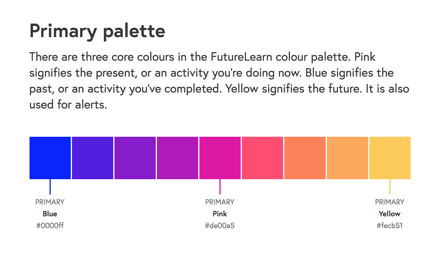
- Colour names: Consider naming colours for their intended use. So you might refer to red as 'attention' for example. You can also put your colours on a spectrum, particularly when pairing with buttons (e.g. loud to whisper).
- Animation: Use videos or animated gifs to illustrate your examples.
Functional components
These are the functional building blocks, which can be lifted and re-used in your designs, such as buttons, tables, light boxes, accordions, etc.
Many design teams, such as Eurostar, use atomic principles to separate out their components into atoms and molecules.
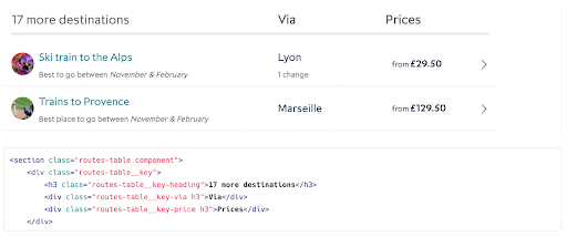
Ultimately it's down to what works best for you, but you may want to consider organising and labelling functionally. For example, components for navigation and others for content presentation. Future Learn is a great example of following this approach.
You will want to specify the layout in different responsive sizes and any interaction states.
Top tips
- Name functionally: Consider using more meaningful names for components that suggest intended use. Future Learn, for example, uses 'Spotlight' rather than 'Hero'.
- Alternative components: You can cross-reference your components and provide alternatives. For example, for a lightbox, you might have 'See also: help tooltips'.
- Code snippets: If your developers have adopted your library, then you can provide a snippet so they can lift code and rapidly implement.
Rules of use
Like a style guide, just having a set of assets is not going to encourage good design. You need a system of rules on how to apply in context.
Personally, I think Material Design, whilst impressive, may have gone too far here. You want the team to actually engage in writing and reading the guidelines, which thousands of words is not going to encourage.
But you should at the least provide a clear description of what the purpose of each component is and when to use it.

Shopify has a clear set of guidelines to accompany each component.
Top tips
- Usage: You may want to provide some guidance on how frequently to use certain elements and in what context. For example, there should only be one primary button per page to represent the main action.
- Dos and don'ts: Provide a clear list of dos and don'ts, which you can illustrate with screenshots. For example, in a lightbox it could be 'do close light boxes using the cross or the background space', but 'don't initiate a lightbox without deliberate user action'.
- Sizing: Unless you've made it so that you can just lift straight into code, consider using some rules to show margins and other dimension parameters.
Maintenance guidelines
The pattern library isn't going to maintain itself and you are always going to come up with new contexts that require new elements or adaption of existing ones.
The best libraries provide some guidance on how to maintain, for example how to describe components giving a clear purpose and even a boilerplate to make a new one.
You will also need an agreed workflow to stop the library becoming a free for all with multiple versions. Different teams are stricter than others in their governance such as Airbnb, where code and design are always in sync and a steering group own the library.
The latest version of Sketch allows you to have shared libraries to reduce diversion from the Master at least for designers.
Creating a design pattern library
Like any digital product, you'll need whatever is going to work best for your users, who are typically going to be your design team and developers.
You can start by creating your pattern library in a tool like Sketch and use Invision to create a prototype of the guideline website.
If you're working in a collaborative product development environment, you may want to replace or replicate with code, which allows the design and development teams to grab code snippets for implementing patterns. It's more time-consuming to create, but probably more efficient in the long run.
We have seen both approaches work for our clients at Inviqa. The important thing is to start somewhere, learn, and evolve. The pattern library shouldn't be a static deliverable as it often is in big web build projects. It's an ongoing project, which hopefully will mean designers can spend less time creating assets and more time solving real user problems.

