The best and worst ecommerce baskets
There are many important pages within an ecommerce journey, but the basket page is critical.
At this point, the user needs to know what they are buying and the full cost implications. It is the last page before the user reaches the checkout and it traditionally has a high rate of abandonment – around 70% on average.
So what makes a ‘good’ versus a ‘bad’ basket
What a bad online basket looks like
The number-one culprit behind any poorly-performing basket is layout. The hierarchy of information needs to display the details in a clean and clear format. A poorly designed basket page with important information displayed in confusing locations can be distracting to the user. And, at this stage of the customer journey, customer distractions can cost you the sale.
Let's look at an example...
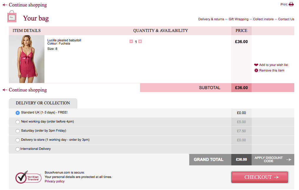
The above checkout has many of the necessary elements to make a successful basket, but there are many over-designed elements. The information is spread across the page and it’s difficult to see at a glance exactly how much the user will be paying.
The background colours serve no true purpose and feel overbearing and slightly distracting. There are also many unaligned design elements that generally feel untidy. The user is unsure where to look for the critical information they need.
This page is also guilty of another common basket error: hiding payment information. Payment information can make or break a purchase decision. If a user knows they can pay by debit, credit, PayPal or via other payment provider, they will be more likely to click through to checkout.
Top tip: keep your basket free of clutter. Keep your hierarchy clear and display the most important information prominently. Make payment options clear to the user before they hit the checkout page.
Here's another example...
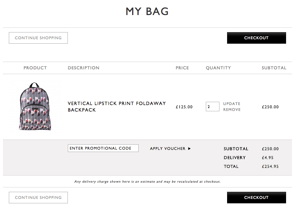
Although this page is an improvement on the first, this particular basket has no true font hierarchy, which does not indicate which information is the most important. The product description, cost, quantity, and delivery fees are all in the same sized font meaning the final price is lost.
Using all caps also de-emphasises the information here as the user loses the shape contrast of each word. That makes it harder for users to read and will increase the chances of them abandoning their basket.
Top tip: vary your font size. Reserve bigger fonts for the most important information on your page, and remember that caps should be reserved for logos and short headlines only.
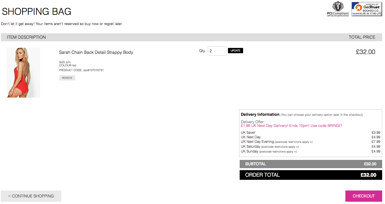
Onto our third culprit (above). Although this site has different font sizes, the copy is tiny. If a user has to squint or zoom in to read important information, you’re asking too much.
Think about advertising. Tiny fonts are used for terms and conditions, for get-out clauses, and legal information. Using small fonts on your basket page suggests you are trying to hide information from the user. Some simple font formatting will make this basket much more appealing.
The checkout button is also hidden at the bottom of the page. This retailer should consider adding another checkout button at the top of the page, especially considering users may be viewing on a small screen resolution and may miss the only button at the bottom.
Top tip: make your copy readable and your checkout button prominent.
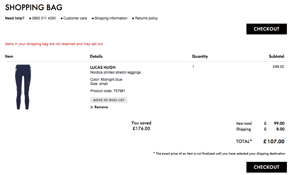
Our last 'bad basket' (above) has two checkout buttons, readable copy, and font of varying sizes. However, the line breaks spread the information across the page. With no background colours to split the page into ‘zones’, the user is given no visual support to help them find the information they need. Overall, the page feels unfinished and needs a polish.
Top tip: don’t overuse whitespace and confusing line breaks. Use background colours sparingly to create ‘zones’ where users can find the information they want.
What makes an effective online basket
Enough of the bad stuff, let’s look at some examples of high-converting baskets:
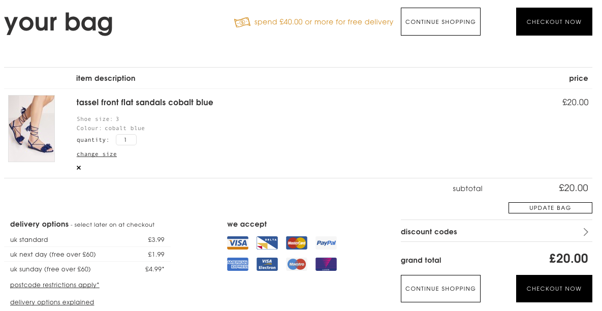
This retailer has clearly thought about their basket carefully and introduced a very tidy, strong hierarchy of information.
The use of grey and black is very clean and brings nice contrast and hierarchy to the text elements. The user knows instantly what the product is, including its size and colour. The payment methods and delivery information is given upfront and are offered in their own designated zones. This gives them some prominence on the page, and offers complete transparency to the user.
The grand total has a very strong position on the page. The font size is the second biggest on the page, which clearly indicates there are no hidden costs.
Top tip: display all delivery and any additional costs upfront. Any surprise fees will only annoy your user who will abandon checkout to find a retailer that doesn’t hide important information from its customers.
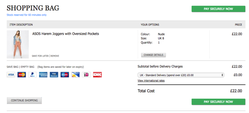
This retailer has a very clean basket page. The user can see all important information before beginning the checkout process – avoiding any sneaky delivery fees in the process.
The button copy is clever here. Rather than just ‘go to checkout’ or simple ‘checkout’, they have used ‘pay securely now’ which instils trust before heading to the payment page. Using green for the most prominent button and a pale grey for any others means it stands out and encourages the user through to checkout.
Payment options are presented clearly, and the careful use of font sizing and formatting ensures the text is easy to read.
Top tip: think carefully about the copy on your basket page and use a hierarchy of colours for your buttons to ensure the most important are given prominence.
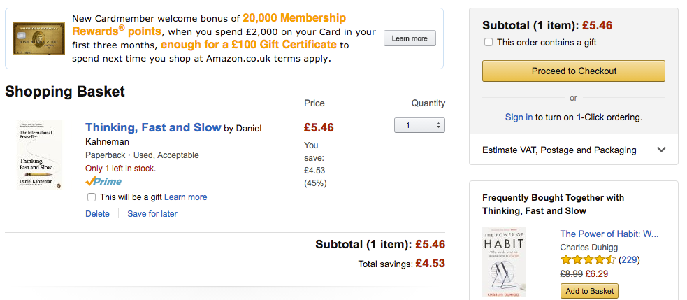
Although many would consider this basket page extremely busy and daunting, the infamous Amazon basket works. Red text gives an indication to the user of pricing and the yellow buttons provide a contrast and break up the page. The blue product title lets the user know that the item is a clickable link and the overall font formatting is precise and tidy.
Top tip: consider the use of colours carefully. Done well, they can break up chunks of text and help you display important information quickly – especially important for speedy shoppers who want to complete a quick purchase.
Some parting words
All in all, basket pages are a very tricky game. You must find a balance between a clear layout and displaying a lot of information at one time. More than anything, your user must trust you and the transaction.
Trust lies in subtlety so don’t forget about the details to ensure you are being completely transparent with you users. Something as simple as size, colour, and font tweaks could turn your basket from a zero to a hero!
About the author
Cimm Man is a senior digital professional with more than 13 years' experience in digital design. He is a true believer in the strength of UX and how it plays its part in design. As a designer, he believes very much in researching user requirements, but also researching current trends and technology to ensure his output is competitive. He always designs and wireframes with multiple devices in mind in order to execute ideas that offer a seamless and frictionless user journey.


